THE CLIENT
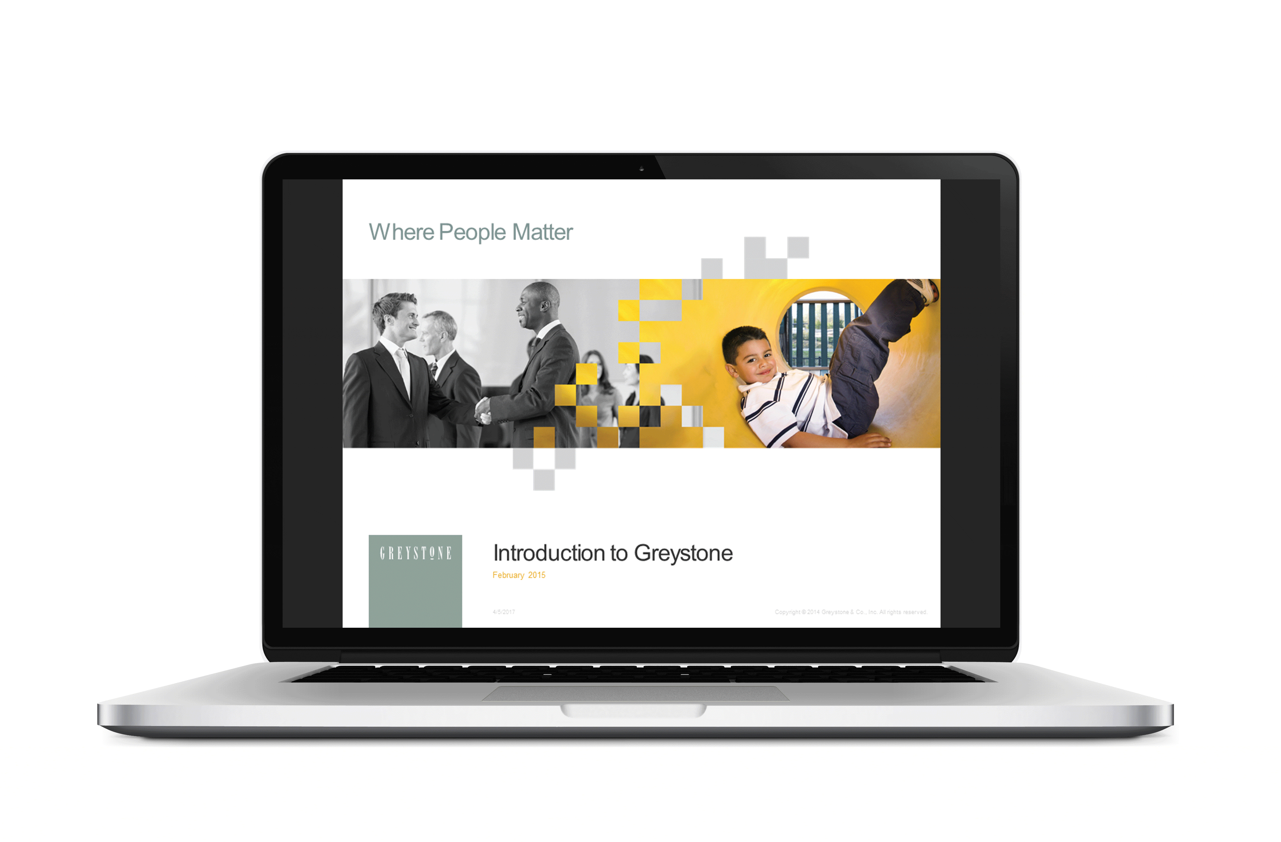
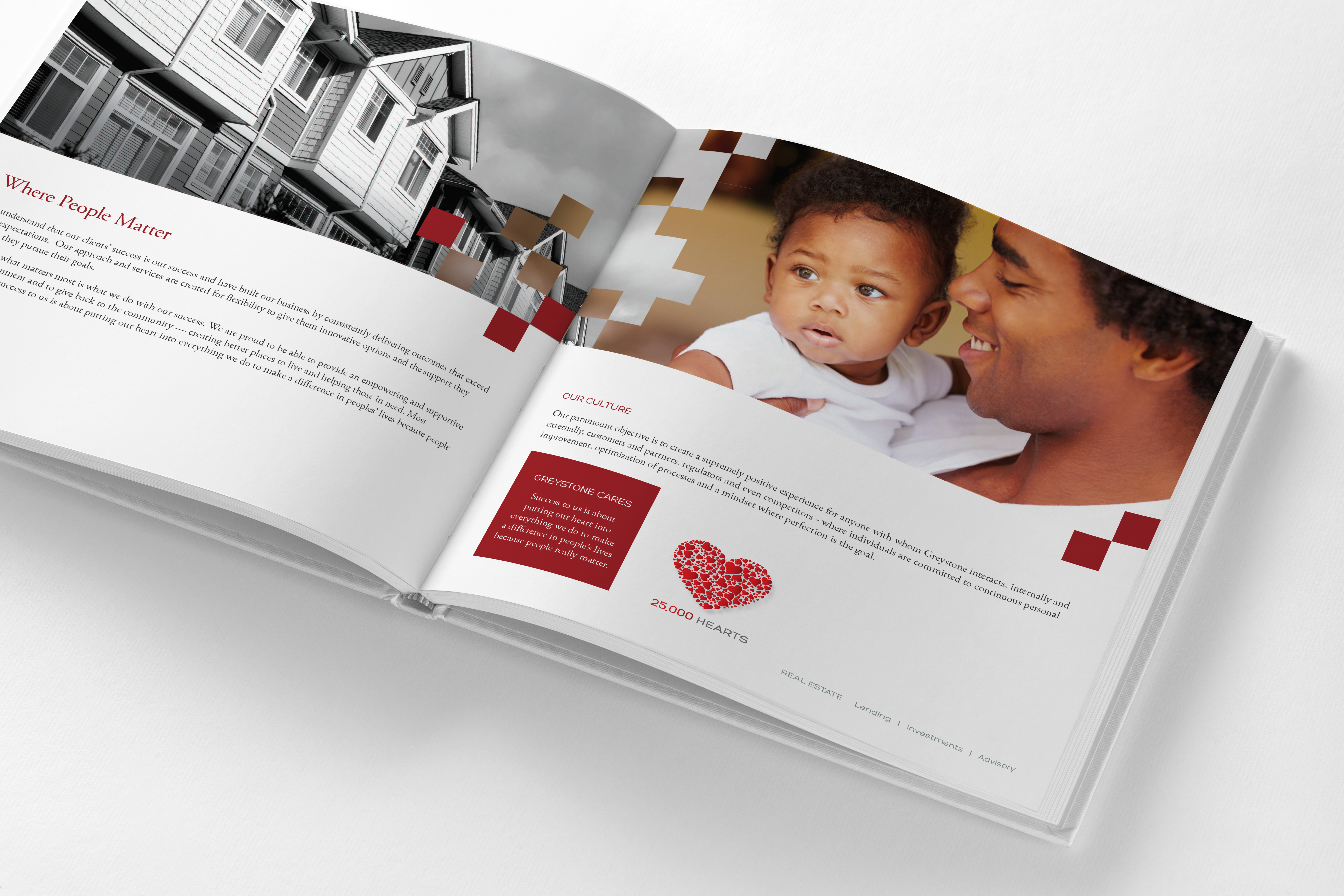
Greystone is one of the nation’s largest real estate lending, investment and advisory services firms with a focus on affordable housing, senior centers, and healthcare facilities. Their culture is reflected in their tagline “Where People Matter”.
THE CHALLENGE
We were asked to create a new brand look and feel that honored and integrated the existing logo, but captured the spirit of the new tagline, “Where People Matter”.
THE SOLUTION
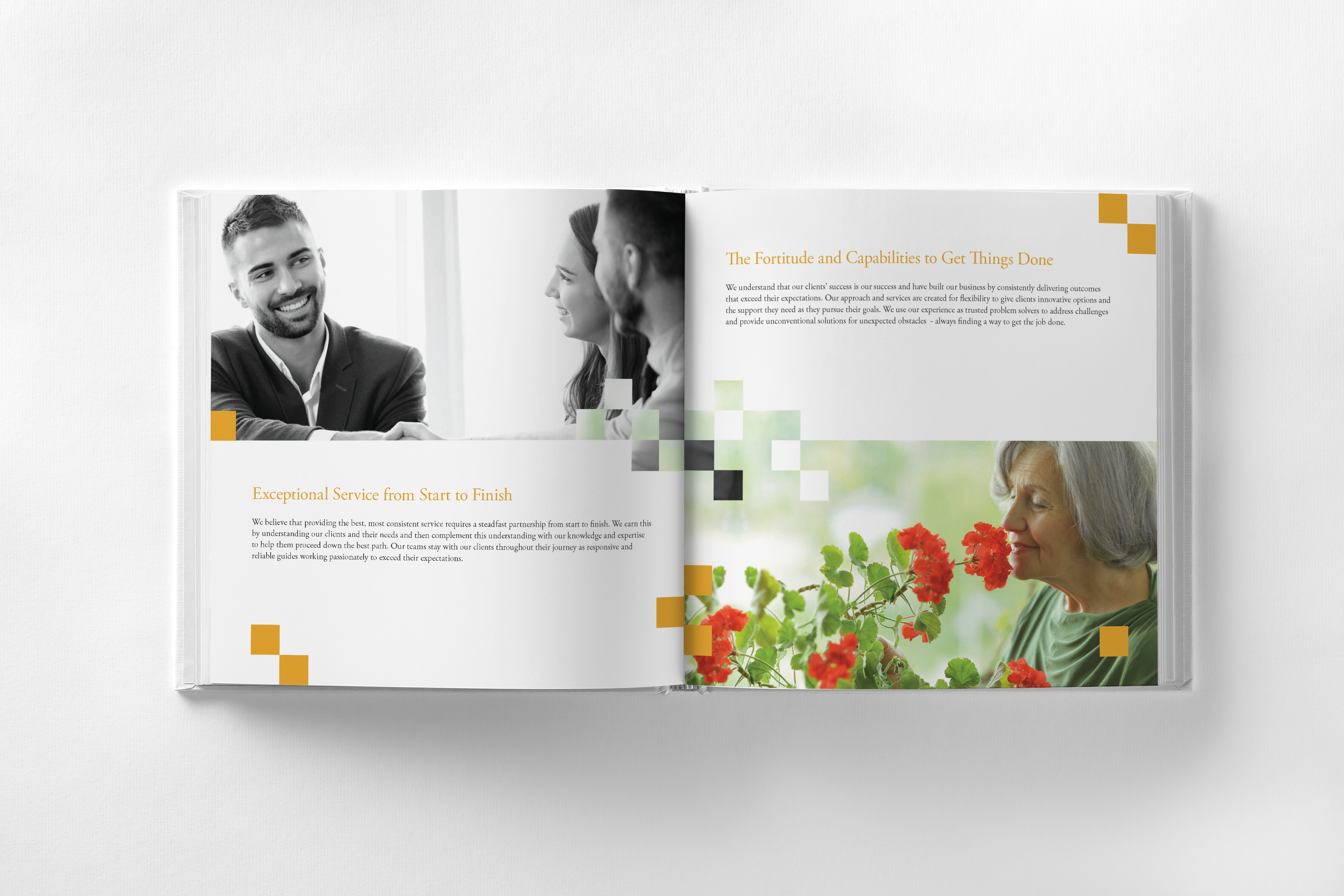
We used the square shape of the GreyStone logo as the basis for the brand identity system. Squares serve as graphic elements on images and the unifying element in information graphics and content holders. The key focus of core brand imagery was to juxtapose images of the type of buildings they affect and the people who live in those buildings. The images were integrated together with a grid dissolve and colored squares sprinkled across the transition between images. This visual language system demonstrates how Greystone is at the intersection of lending and investment that truly affects people’s lives in a positive way.