THE CLIENT
DXC Technology manages and transforms mission-critical technology for large, complex organizations.
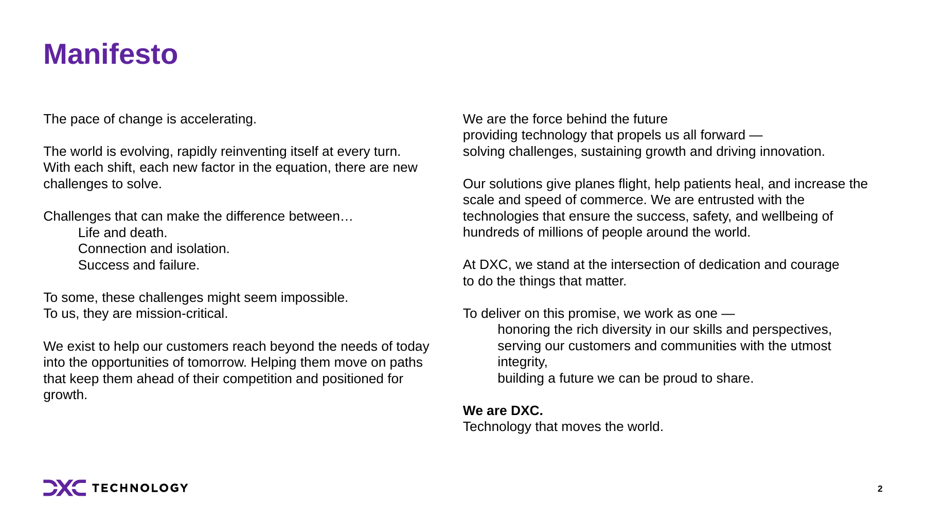
Andrea O’Neill served as DXC’s lead strategic partner over several years, supporting stakeholder communications, brand architecture, ABM strategy, messaging, and digital and sponsored experience marketing. She wrote the manifesto and designed the purple DXC logo. This case highlights selected brand strategy, narrative, and identity work from that broader relationship.
THE CHALLENGE
The importance of DXC’s work could disappear behind the language of IT systems and services. Yet those systems kept airlines operating and helped address challenges as complex as safety and security during the Hajj pilgrimage. The brand needed to make that responsibility tangible and communicate the expertise required to take on work where failure has real consequences.
The existing DXC name also offered little explanation of what the company stood for. There was an opportunity to connect its letters to a meaningful story.
THE SOLUTION
Working with Sustena, we developed a brand story around the complexity of the challenges DXC solves and the importance of getting them right. “Mission-critical” connected technical capability to its consequences for customers and the people who depend on them. Andrea wrote the manifesto to give that idea a human voice, expressing the determination and collaboration behind the technology.
“At the intersection of dedication and courage” gave the existing name a meaning grounded in that story. Dedication spoke to the commitment to keep essential systems working. Courage spoke to taking on difficult challenges.
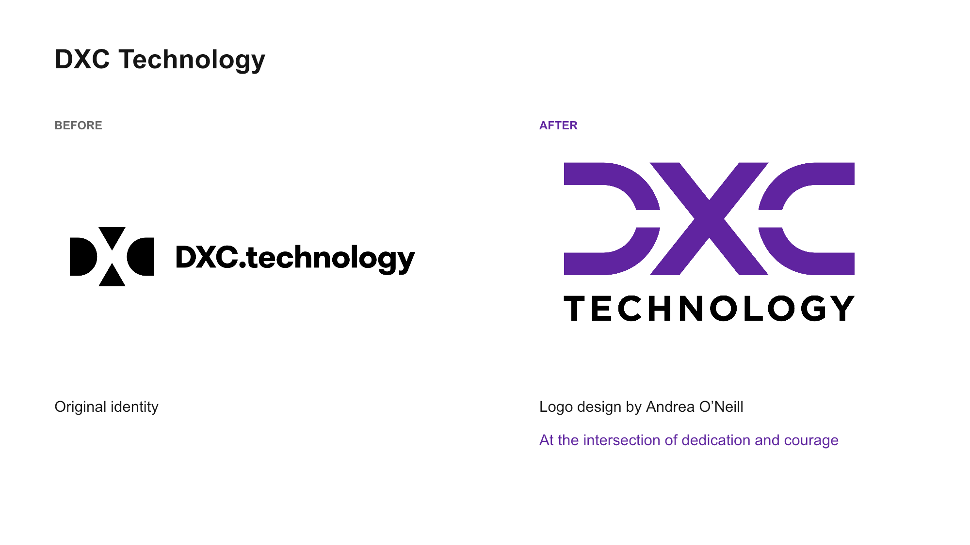
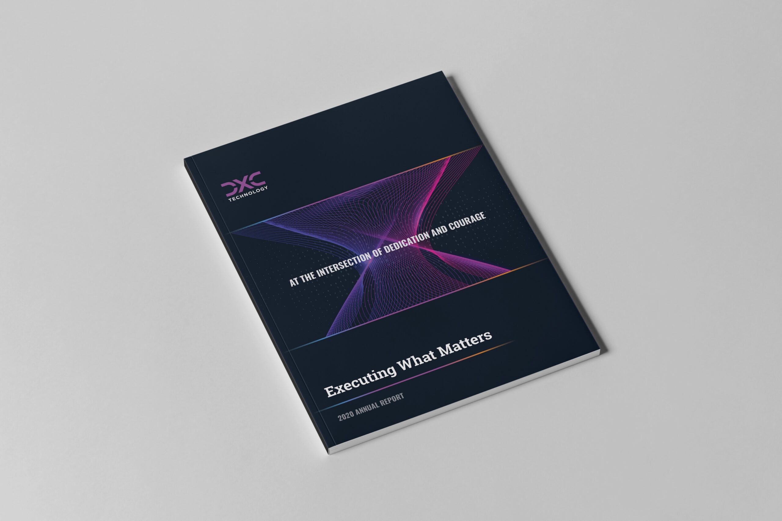
Andrea O’Neill designed the purple DXC logo, with the X forming the intersection between D and C. The negative space creates arrows pointing toward that center. A twisting digital vortex carried the intersection into the wider visual system, with converging lines and data patterns expressing complexity around a common point. An orange-to-blue gradient passing through purple connected the supporting graphics.
The brand framework brought the narrative and visual expression together with culture, services, and experience, providing a structure for explaining the brand beyond its logo.
Selected identity and brand development work created with Sustena. Gallery applications are concepts and mockups.