THE CLIENT
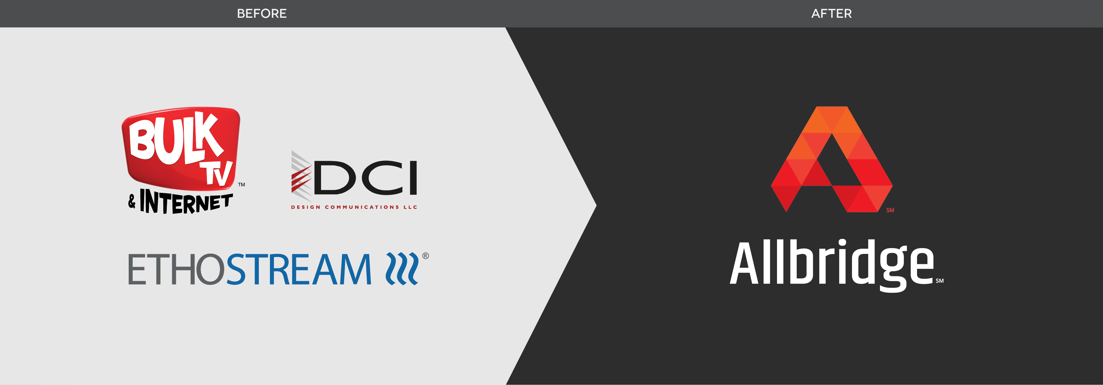
Allbridge is a merger of three different data, video, and voice technology providers — Bulk TV, DCI, and Ethostream — that serve hospitality, healthcare, and higher education properties.
THE CHALLENGE
The challenge here was multi-faceted:
- Create a brand with the visual presence to build market trust in a new brand that was replacing several trusted individual brands.
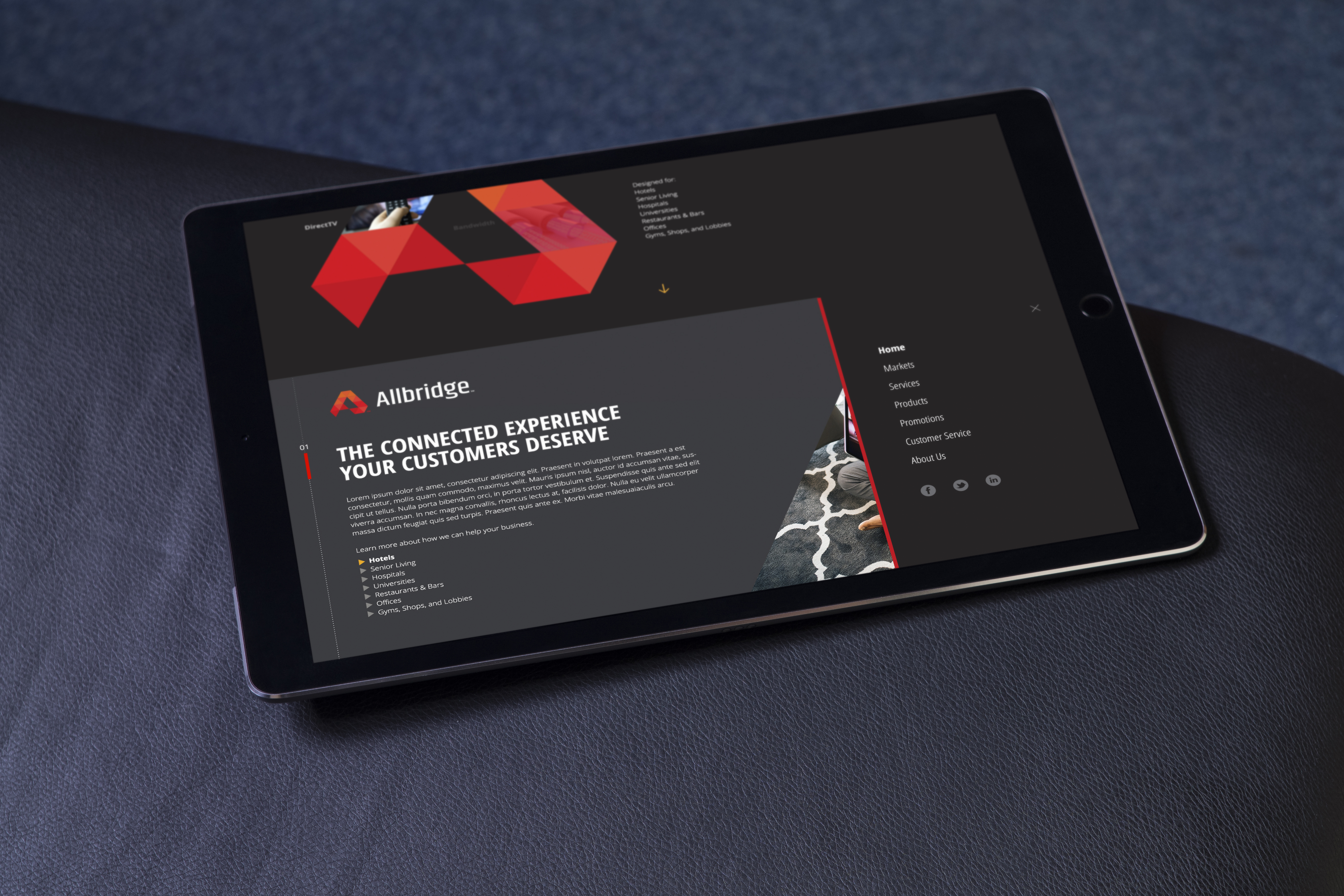
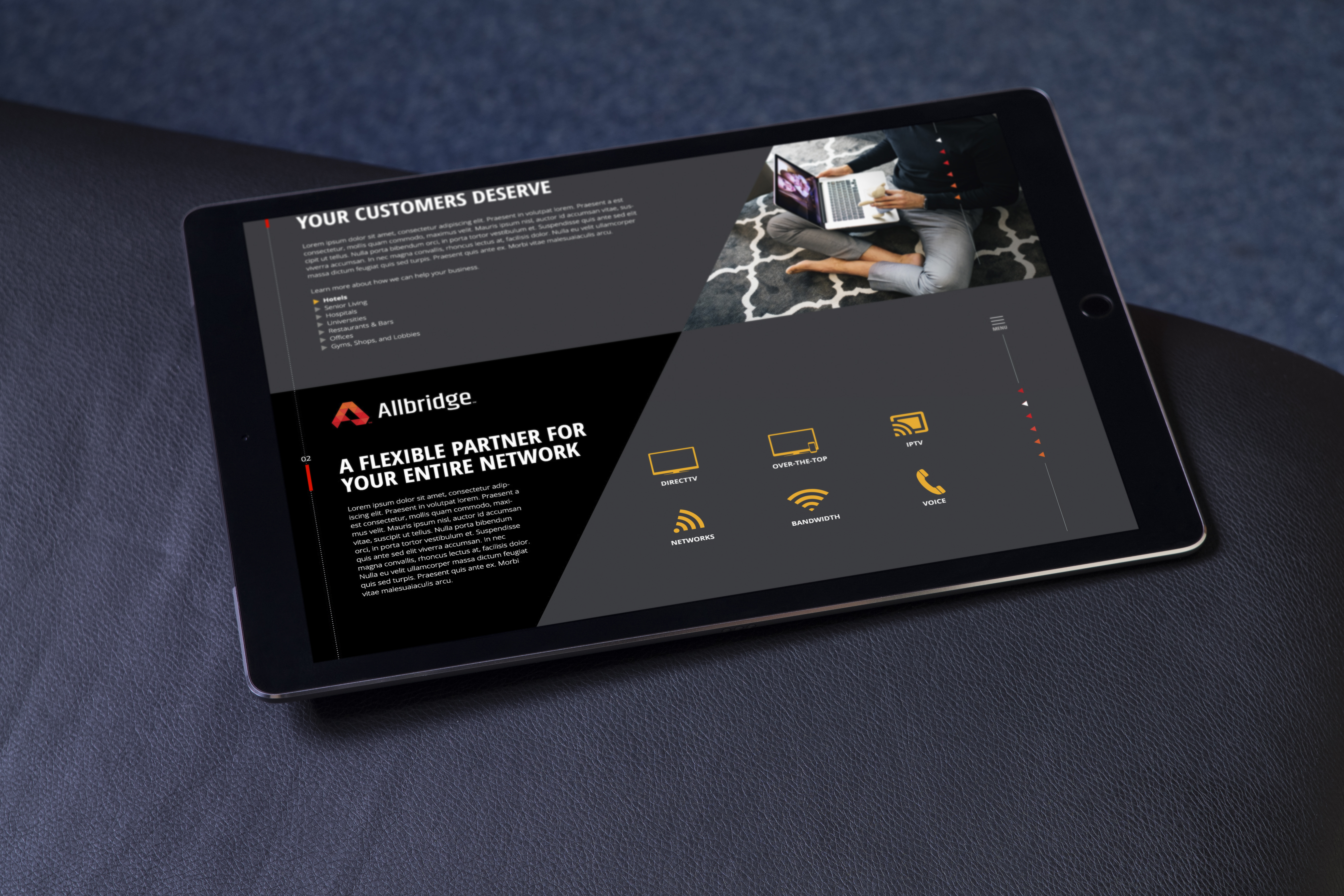
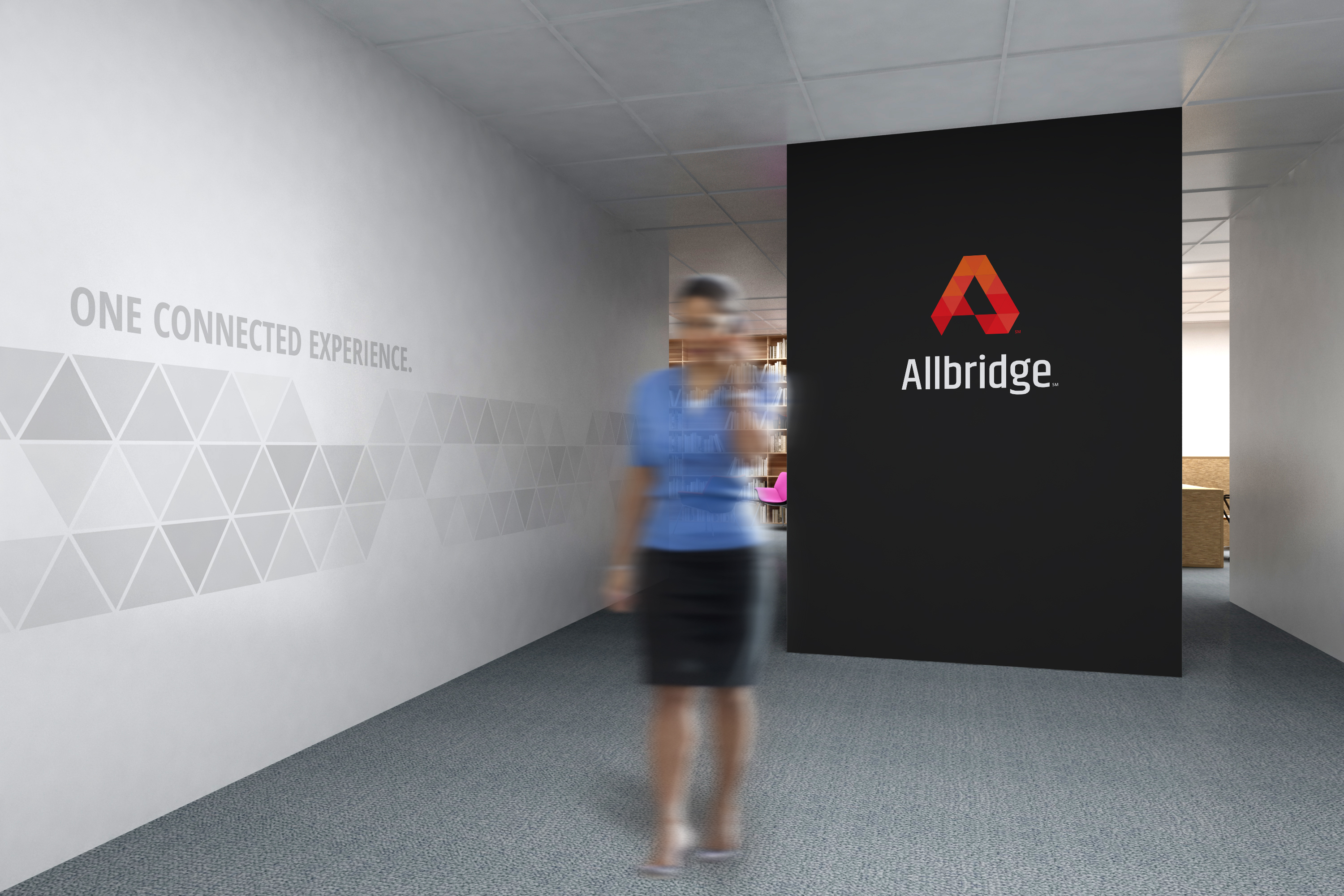
- Create a brand identity that supports messaging around a unified solution for data, video, and voice from one technology provider. A combination offering solution has traditionally been a challenge in this market. Large hospitality, healthcare, and higher education entities typically choose a provider who specializes in either data, video, or voice solutions, but not all three. The visual brand needed to support a story of the power found in a single connected experience from Allbridge. The tagline provided by our partner agency Sustena Group was, “One Connected Experience”.
- Create a brand with a visual style that overcame the very diverse visual brand attributes of the three original brands of the merger.
THE SOLUTION
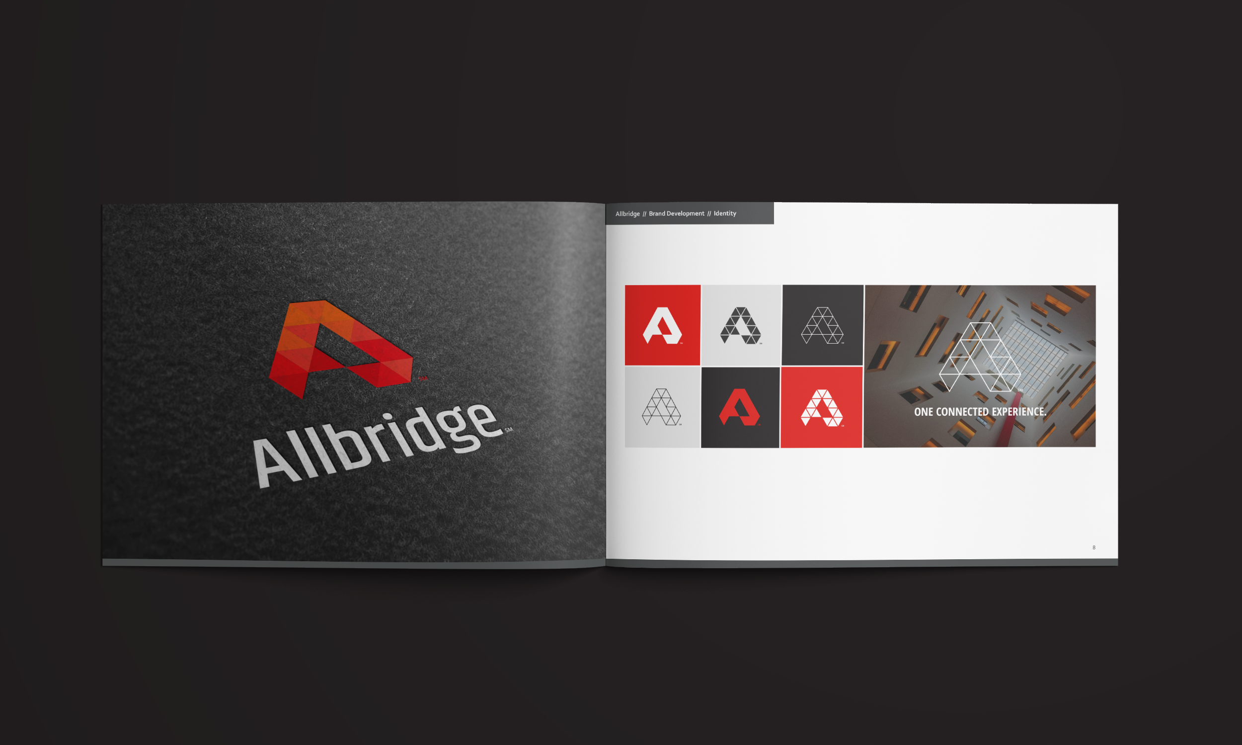
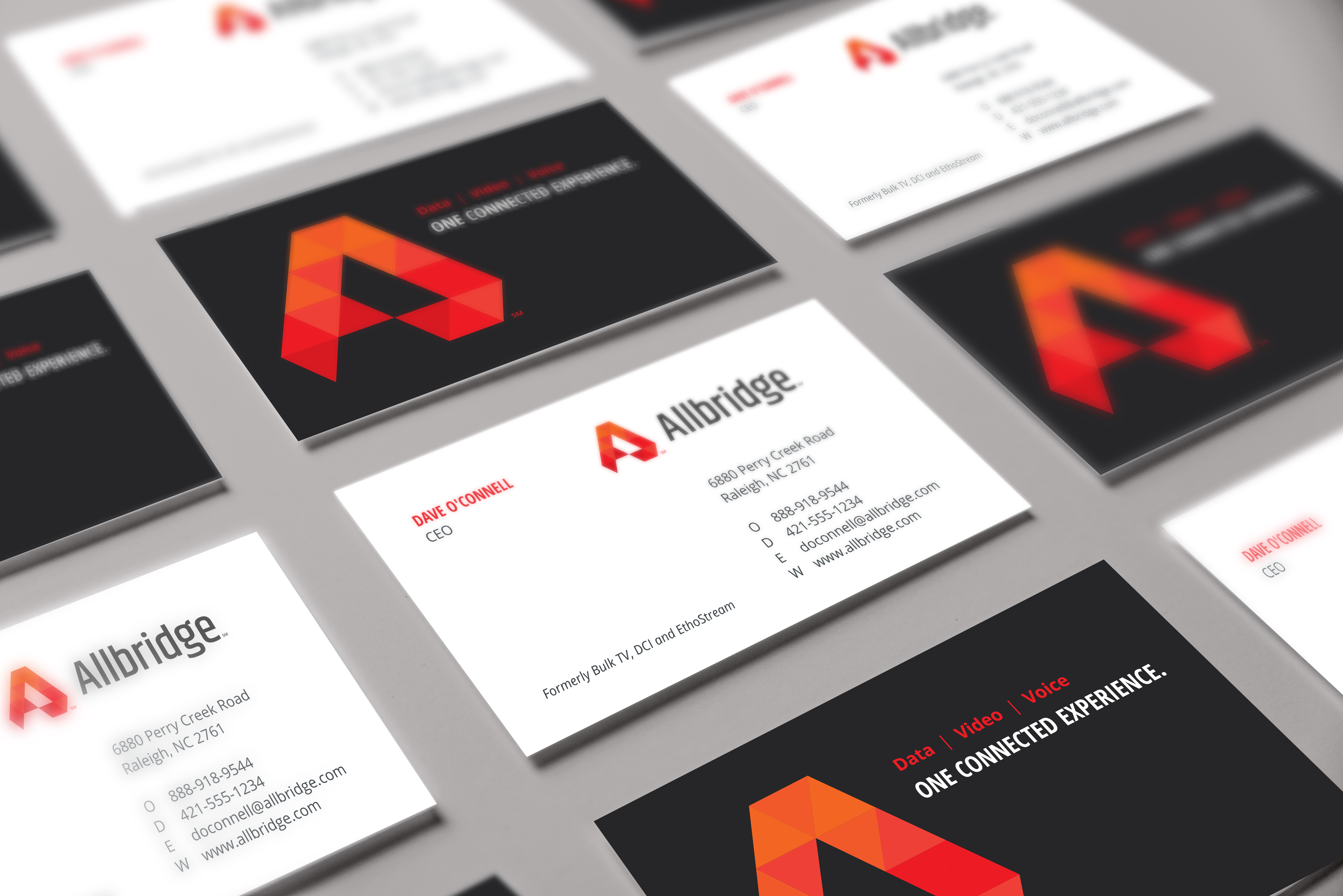
We created a logomark that illustrates the concept that Allbridge encompasses many services all in one entity, and that all of these pieces add up to a better-connected experience.
- A stylized A supports the new name — Allbridge
- The overall A is based on the shape of a triangle which represents the three sides of its foundational entities — Bulk TV, DCI, and Ethostream — and also the three core service umbrellas: data, video, and voice.
- The A is composed of many individual triangles that represent the myriad solutions that Allbridge provides under the umbrellas of data, video, and voice.
- Varied shades of red are used to keep an element of consistency from the previous BulkTV and DCI identities.
Triangular elements are a foundational component of the overall visual brand beyond the logomark.
- A triangular grid sits behind many graphics, photographs, and other visual elements. It represents the Allbridge data infrastructure behind everything they do.
- Gray triangles at varying shades of opacity fade in and out of the grid to represent the smooth and consistent movement of data enabling Allbridge connected solutions.
- Angled borders following the triangular grid add branded elements to even simple text bars on a website and in collateral.