THE CLIENT
Frontier Growth is a growth equity firm that supports software businesses with investment capital and operational expertise.
THE CHALLENGE
Frontier needed to stand out in a crowded field of growth equity firms. Interviews with existing clients revealed that what Frontier considered simply part of its culture—caring about the people, not just the deal—was a powerful reason clients chose to work with them. “People Before Numbers” captured that difference. The design challenge was to make this defining strength visible and recognizable across the firm’s communications.
THE SOLUTION
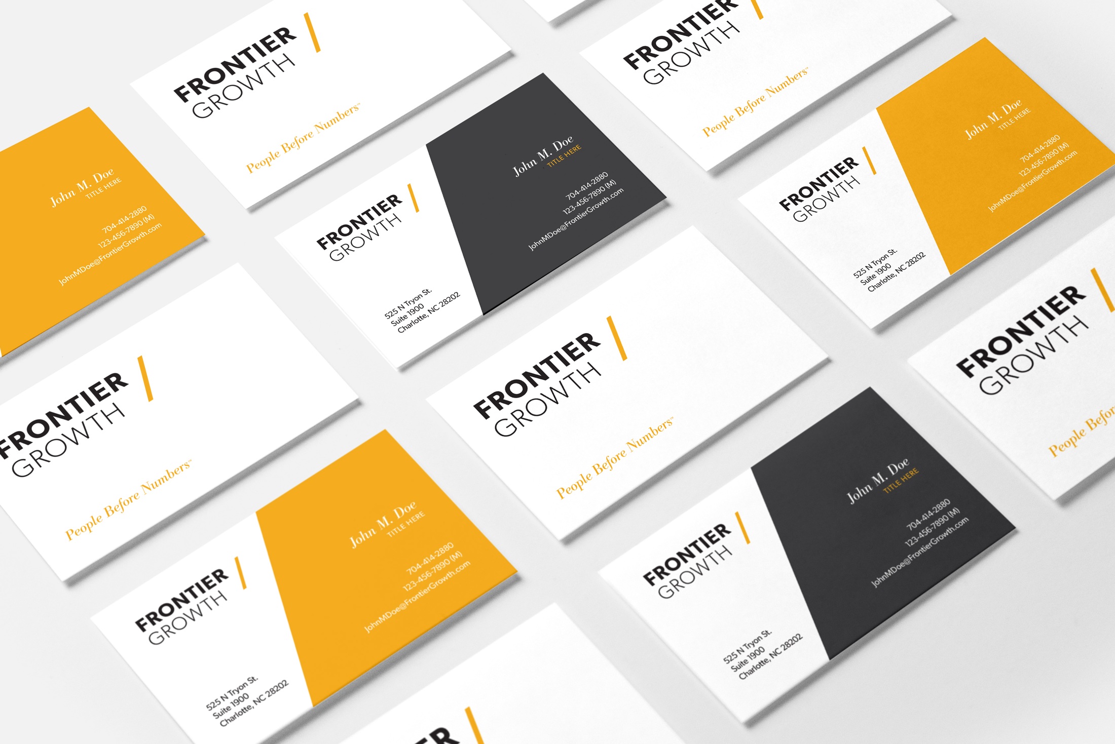
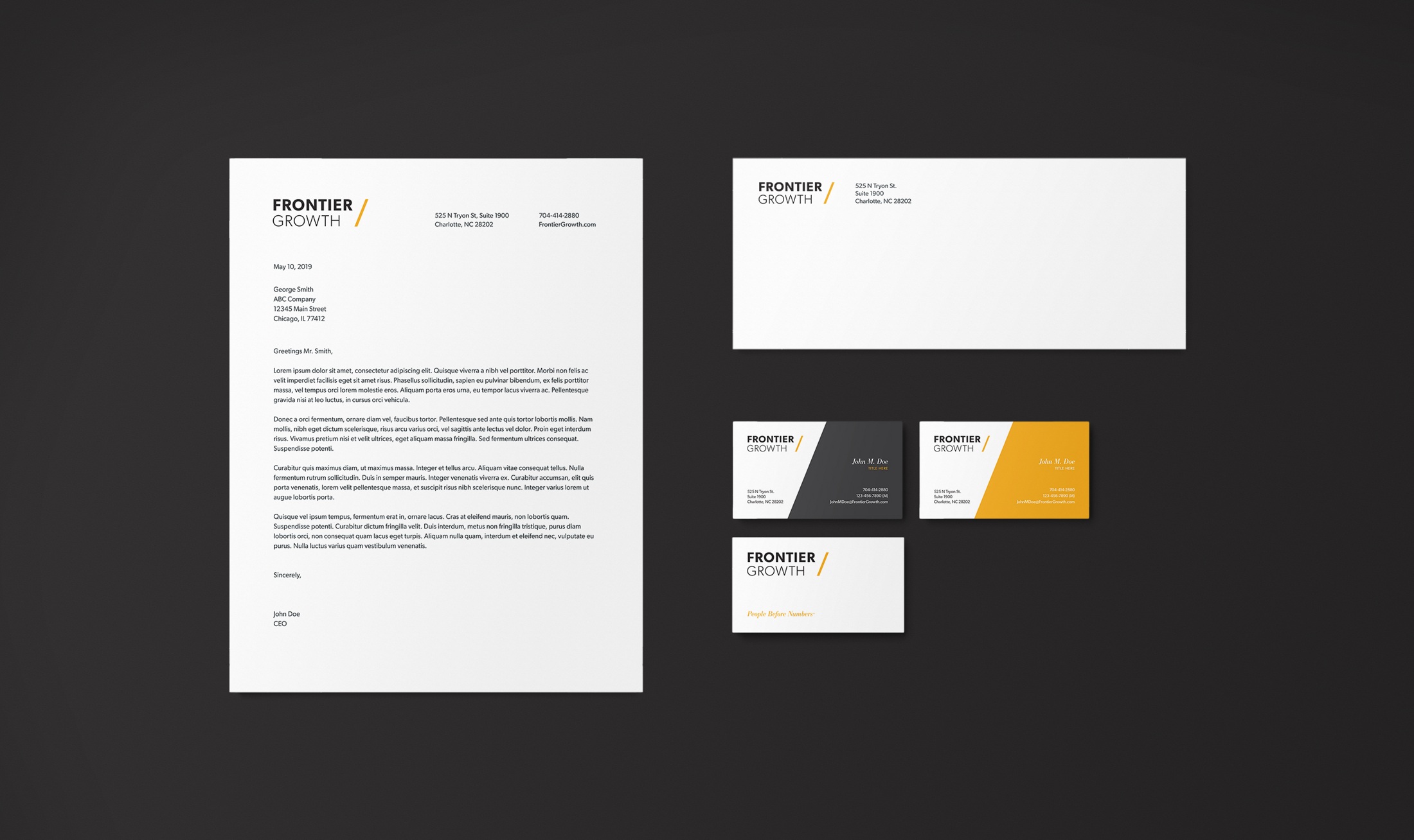
The visual identity pairs a straightforward wordmark with a gold forward slash. The slash represents both the connection between Frontier and the people it partners with and the strong upward growth trajectory it helps create for its portfolio companies.
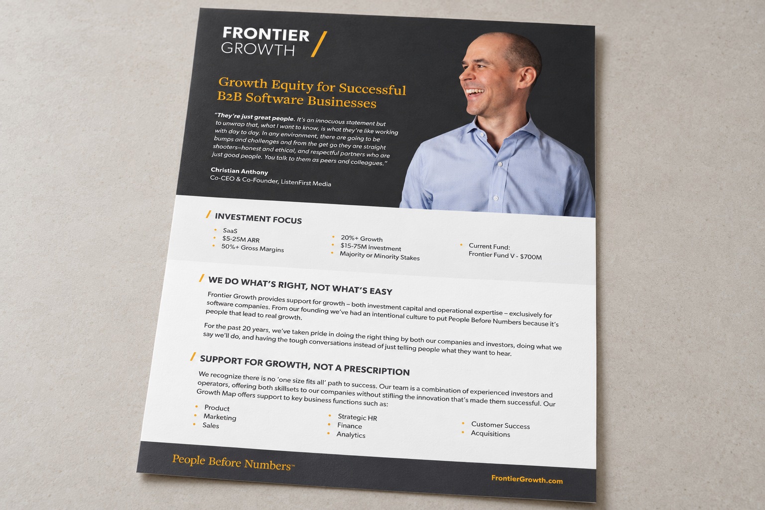
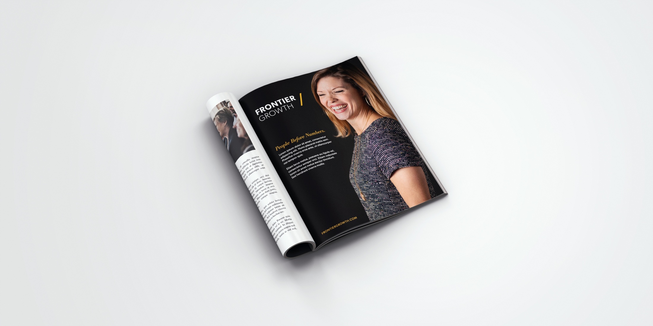
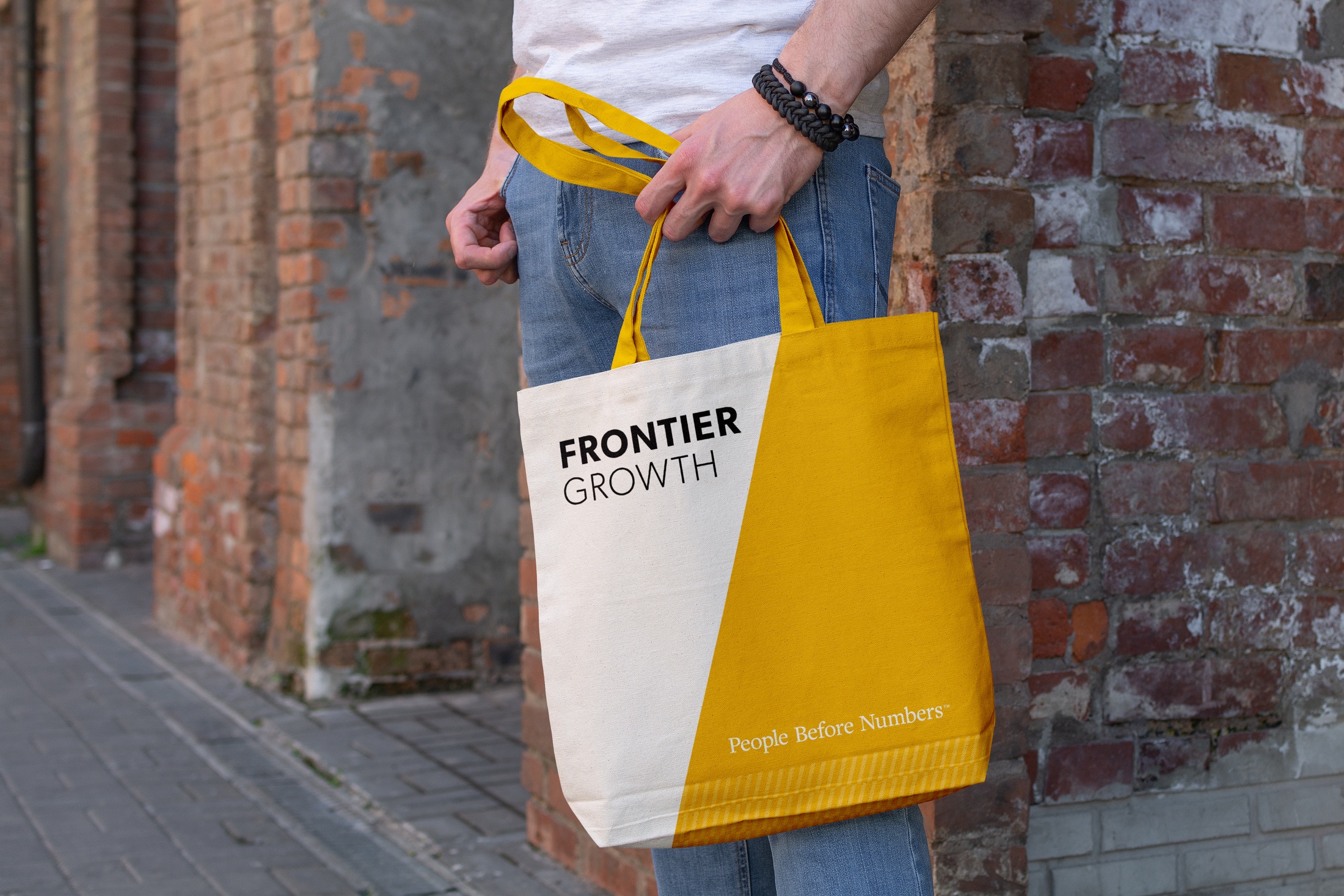
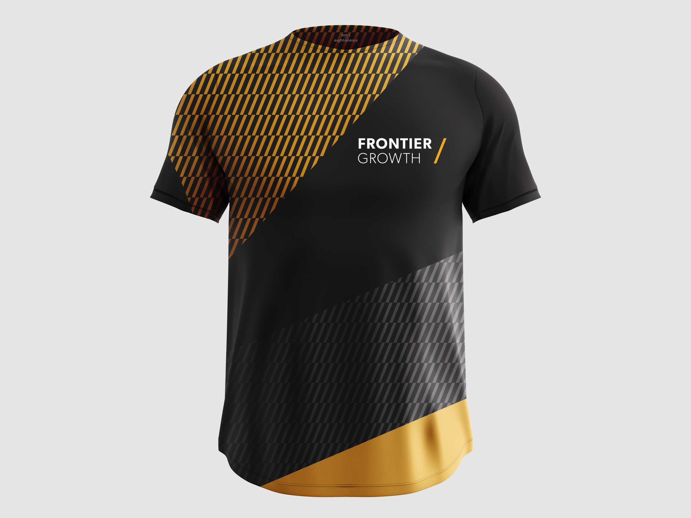
Warm, expressive portraits put people at the center of the brand. Gold and charcoal establish a consistent palette, while angled shapes drawn from the slash frame imagery, divide information and carry the identity across applications.
The selected work shows how that system extends through business cards, stationery, an overview sheet, an advertisement, office graphics and merchandise. Each application gives the same idea a different expression while keeping the brand recognizable.
Design work by Andrea O’Neill, in collaboration with Sustena. 2019.