THE CLIENT
Acutus Medical is a team of dedicated medical scientists, biomedical engineers, and other professionals focused on the development of medical technologies designed to revolutionize the treatment strategies of patients with complex cardiac arrhythmias, specifically atrial fibrillation.
THE CHALLENGE
As a creator of new breakthrough technologies, Acutus faces the challenge of being relatively unknown in the field while also requiring premium pricing for their advanced devices. Commanding premium pricing is difficult if your brand looks immature. We were asked to help elevate the sophistication of Acutus’s existing brand to better represent the quality of their solutions and help garner the attention of electro-physiologists and hospital buyers. The brand needed to provide a clean backdrop to showcase the company’s revolutionary technology and still differentiate the company from its competitors. The company wanted to keep their existing logo, but update the visual brand system in their look and feel.
THE SOLUTION
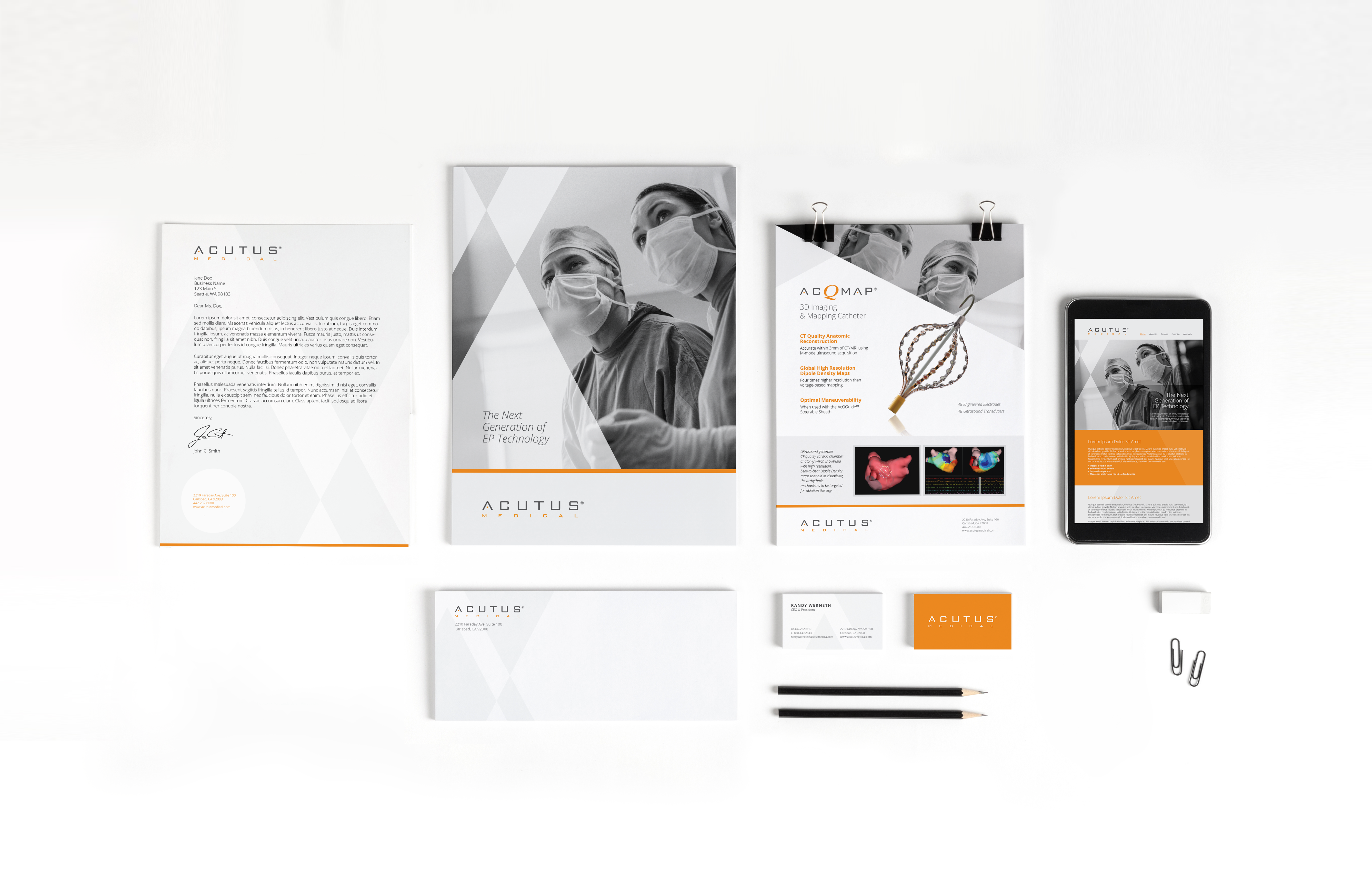
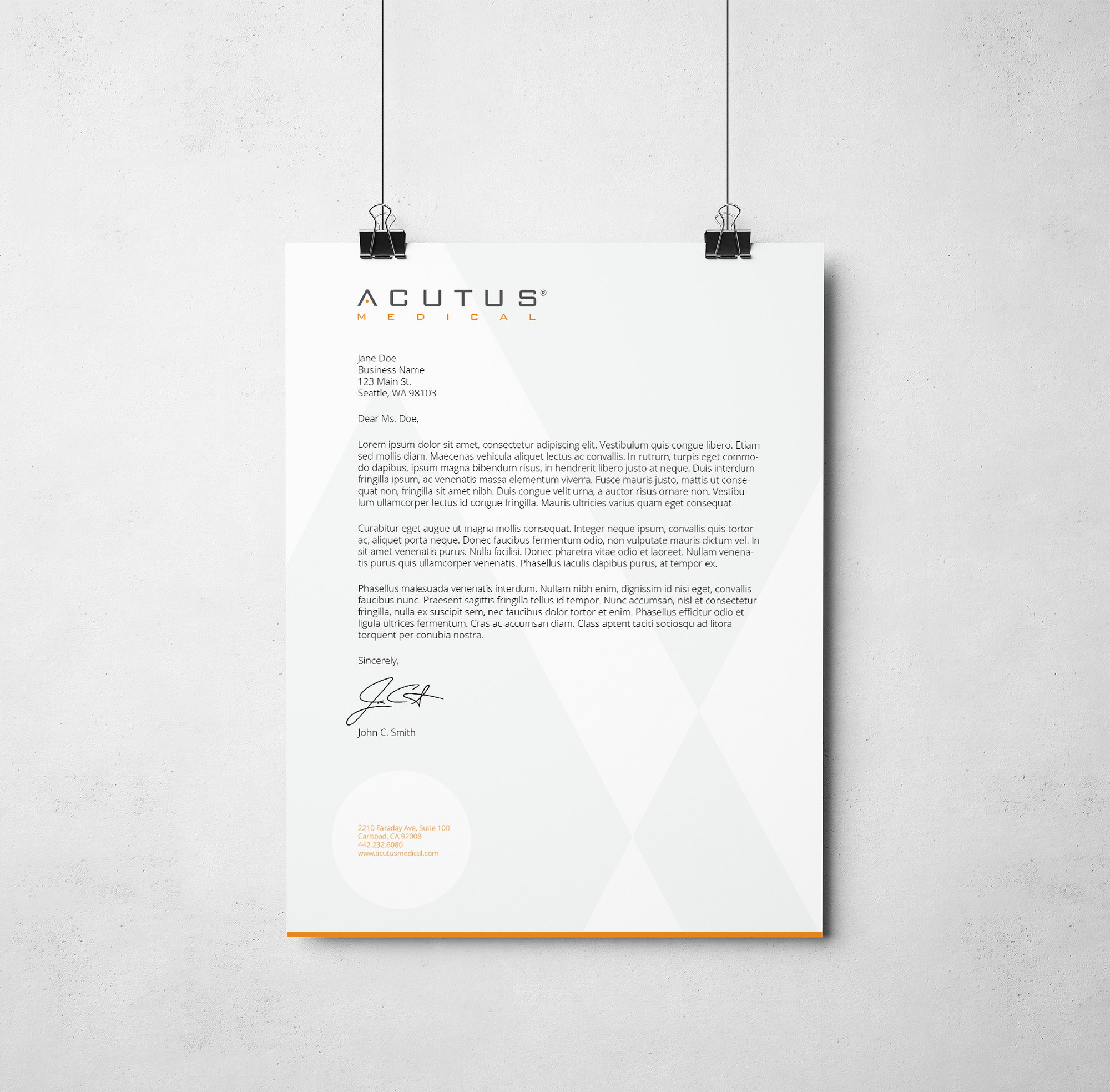
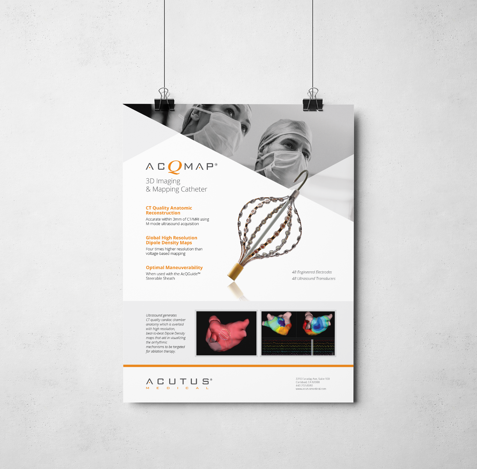
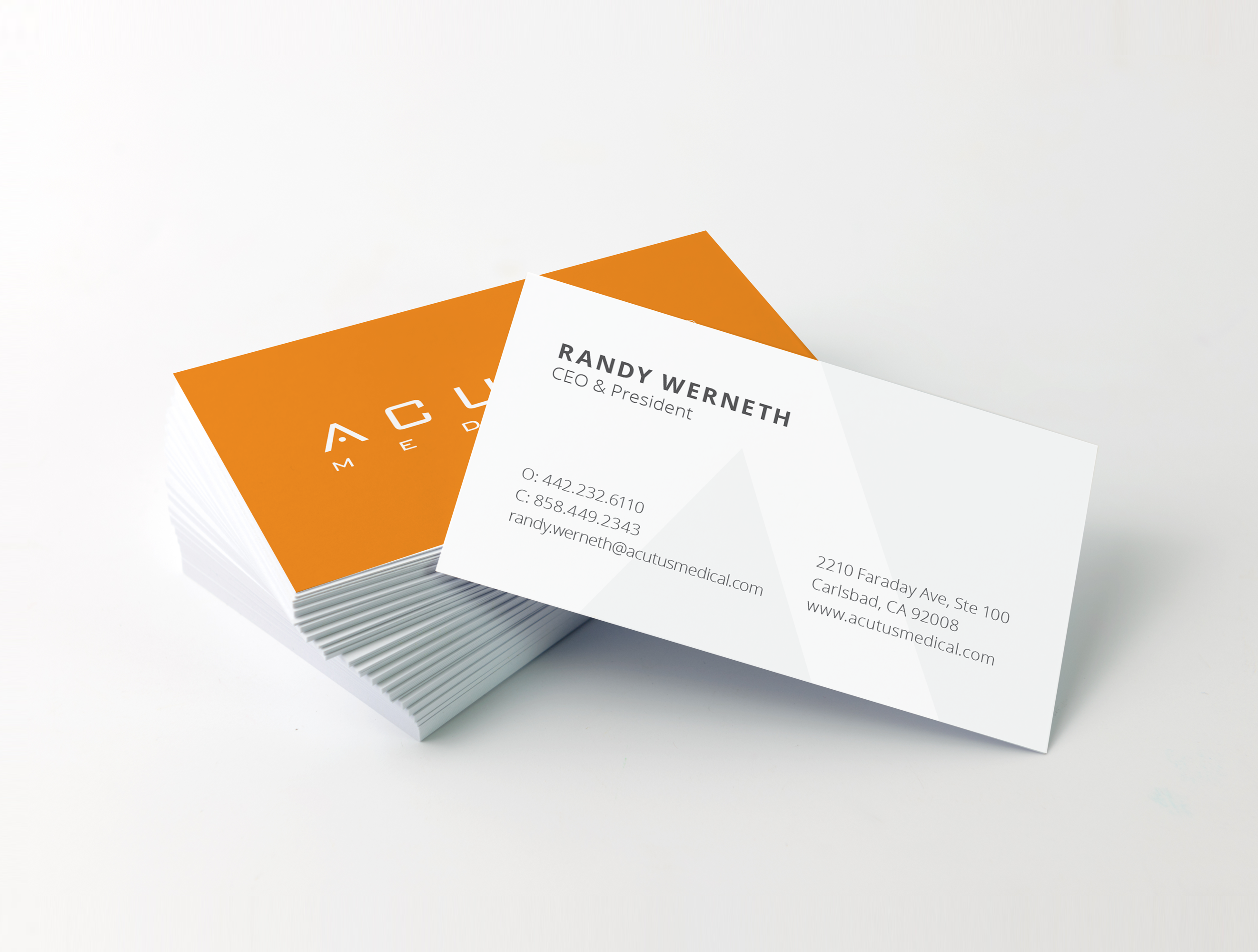
We created a brand look and feel based on an abstract variation of the A from the Acutus logo. By taking the far left outside edge of the A and pulling it across to the right, a unique form was created that provides a dynamic visual element to add interest and texture across marketing materials. The sharp convergence of angles into a focused point of contact speaks to the ideas of Acutus’ accuracy and precision within their unprecedented ability to pinpoint sites crucial to the causes of atrial fibrillation and other cardiac arrhythmias.
While the shape itself is not an obvious variation of the logo, the visual resonates with familiarity on the page when paired with the logo. It is something felt more than inherently seen. This supports audience recognition of the logo and creates a unique visual system that can be integrated into almost any item.